App Design
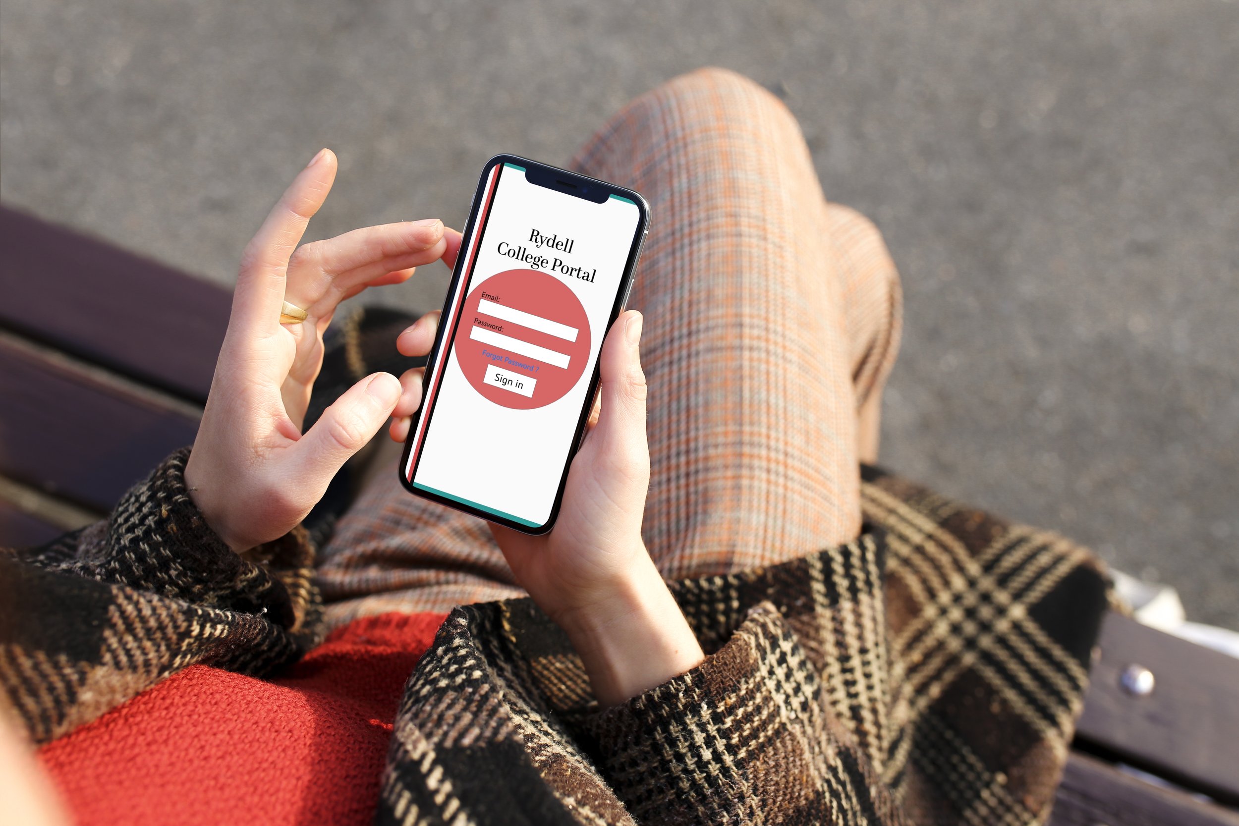
In my app design I originally created it for my old school. It is a redesign of a student portal app. I created mockups and prototype of what the app can look like. For the name of the school, I chose to do a fake school name from my one of my favorite movies Grease.
Sketches
Digital Wireframes
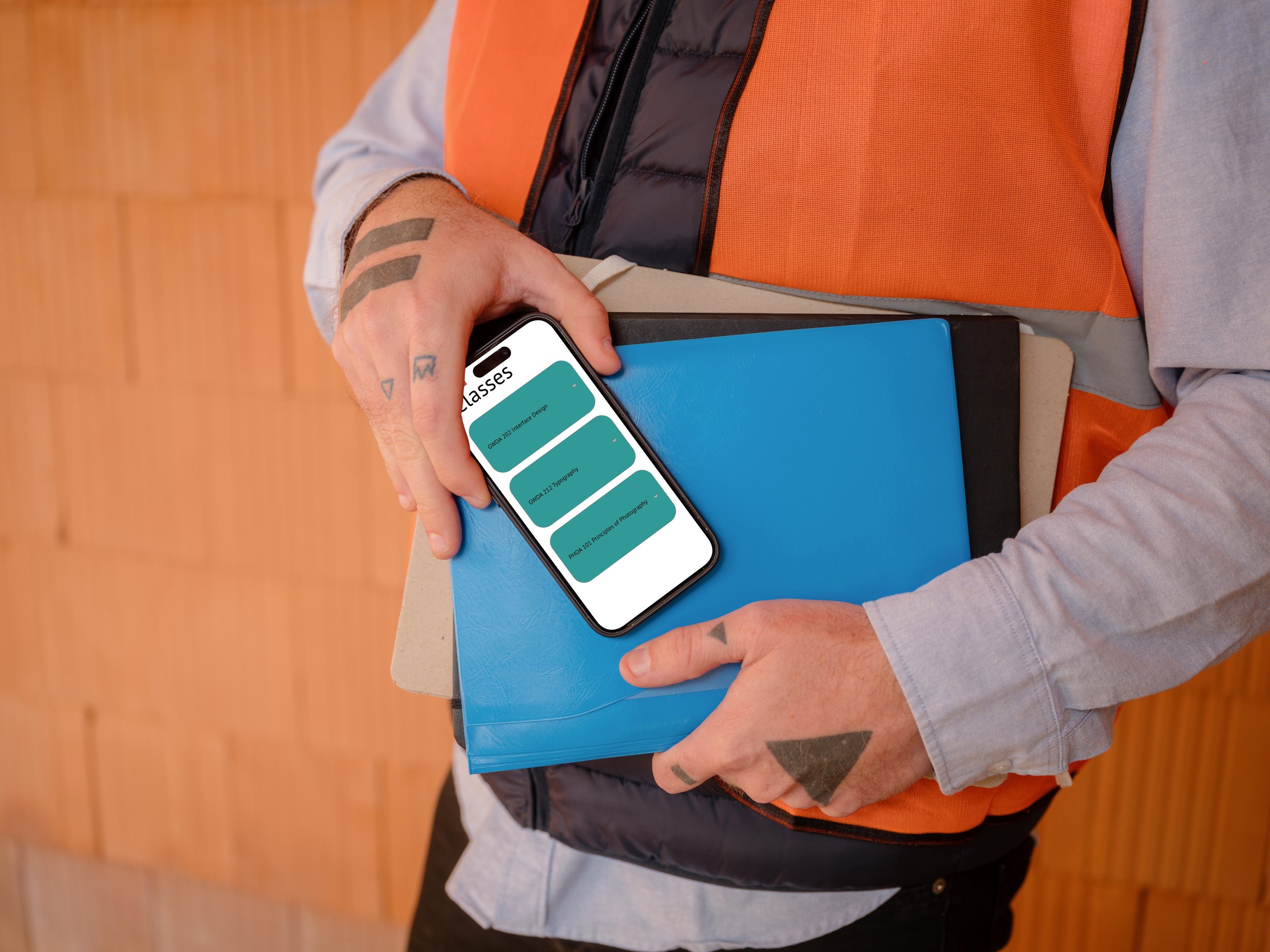
Here is what each page looks like. The goal of creating this app design was to make it student friendly. Being as I am a student, I just created what I would want from the student portal app and what it could look like based on my preferences. I added a social page as it could be a way for students to interact with each other.
Color Palette
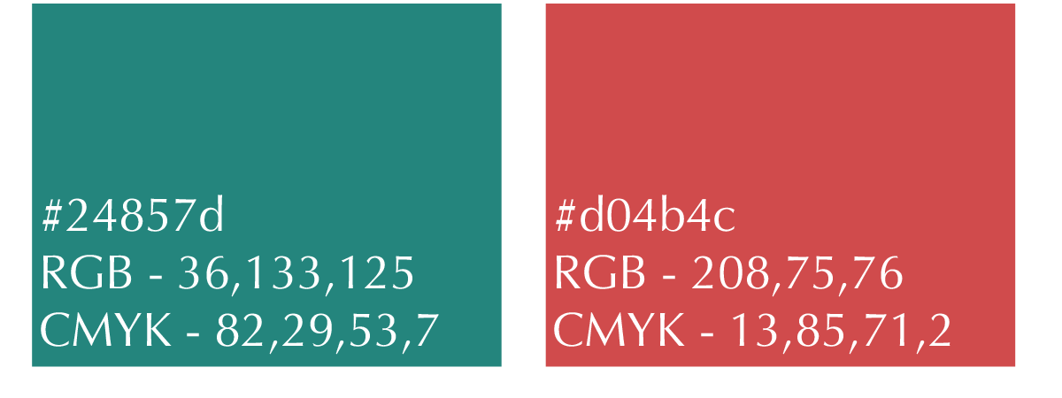
I chose these colors because they are bold and bright. Red and real are polar opposites when it come to the meaning of what the color is. Red is very vibrant and exciting, while Teal has a calmness and relaxation energy. Together they balance each other out and creat an inviting atmosphere.
Typography
For the type I stuck to a clean and simple font PT Sans for the entire app. I used the Abril Display font for the title of the student app.


